CSS tools and frameworks
class: center, middle .title[ Front-end training # HTML/CSS tools, practices and frameworks ] --- #Emmet .columns[.col-50[ Emmet is a plugin for many popular text editors which greatly improves HTML & CSS workflow: This line in editor: ``` css ul.emmet>li*3>a ``` converts to: ``` html <ul class="emmet"> <li><a href=""></a></li> <li><a href=""></a></li> <li><a href=""></a></li> </ul> ``` ].col-50[ 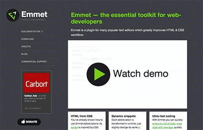 .center[ [http://emmet.io/](http://emmet.io/) ] ]] --- # HTML5 Boilerplate .columns[.col-50[ The web’s most popular front-end template. HTML5 Boilerplate helps you build fast, robust, and adaptable web apps or sites. Kick-start your project with the combined knowledge and effort of 100s of developers, all in one little package. - Analytics, icons, and more - Normalize.css and helpers - jQuery and Modernizr - High performance ].col-50[ 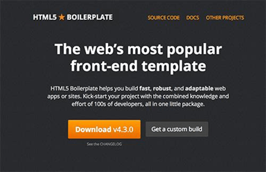 .center[ [http://html5boilerplate.com/](http://html5boilerplate.com/) ] ]] --- # HTML5 Boilerplate .center[ 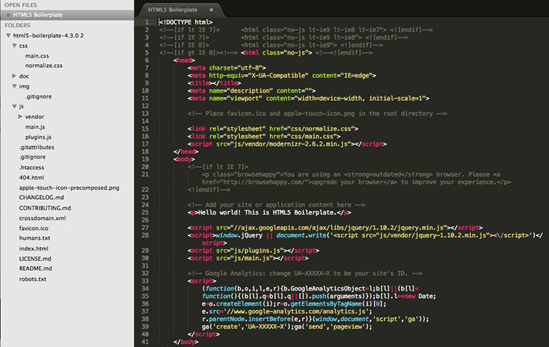 ] --- #Grid 960 960.gs provides a set of columns, written in CSS, that facilitate the laying out of web pages. Download the files, add them to your website and it’s ready to go. No special plug-ins or new technology are needed, and you can use it in conjunction with other CSS files. .columns[.col-50[ ``` html <div class="container_12"> <div class="grid_7 prefix_1"> <div class="grid_2 alpha"> ... </div> <div class="grid_3"> ... </div> <div class="grid_2 omega"> ... </div> </div> <div class="grid_3 suffix_1"> ... </div> </div> ``` ].col-50[ 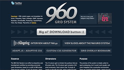 .center[ [http://960.gs/](http://960.gs/) ] ]] --- # How to manage css on complex websites? Example 1: a large set of UI elements repeatable on a different pages. .img-wrap-90.center[ 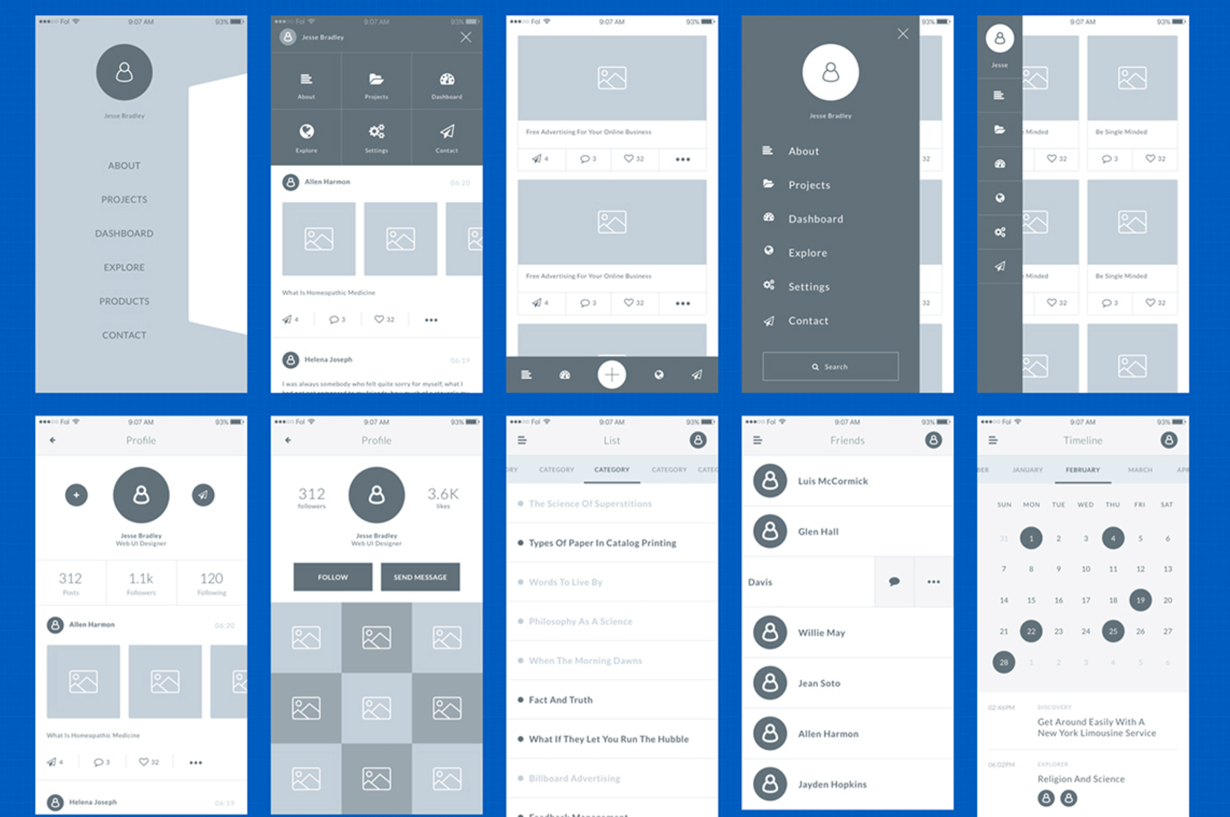 ] --- # How to manage css on complex websites? Example 2: an admin panel with a lot of components that shares same controls insode. .img-wrap-90.center[ 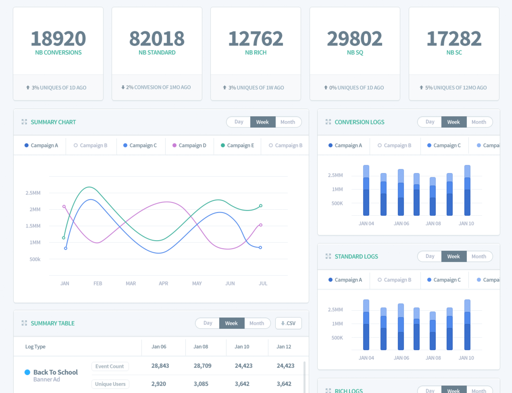 ] --- # SMACSS .columns[.col-50[ A flexible guide to developing sites small and large. Is more style guide than rigid framework. At the very core of SMACSS is categorization. By categorizing CSS rules, we begin to see patterns and can define better practices around each of these patterns. There are five types of categories: - Base - Layout - Module - State - Theme ].col-50[  .center[ [http://smacss.com/](http://smacss.com/) ] ]] --- layout: true # SMACSS --- .columns[.col-60[ **Base** rules are the defaults. They are almost exclusively single element selectors, attribute selectors, pseudo-class selectors, child selectors or sibling selectors. **Layout** rules divide the page into sections. Layouts hold one or more modules together. **Modules** are the reusable, modular parts of our design. They are the callouts, the sidebar sections, the product lists and so on. **State** rules are ways to describe how our modules or layouts will look when in a particular state. **Theme** rules are similar to state rules in that they describe how modules or layouts might look. ].col-40[ 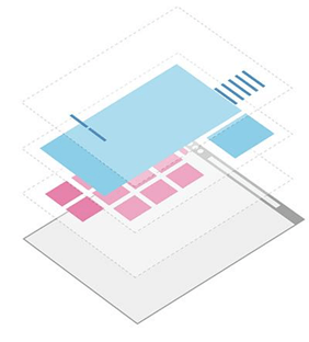 ]] --- ##Base .columns[.col-40[ ``` css body { background-color: #fff; color: #222; } p, ul, li { padding: 0; } a, a:hover { color: blue; } input[type=text] { font-family: Georgia; background-color: #fff; color: #000; } ``` ].col-60[ 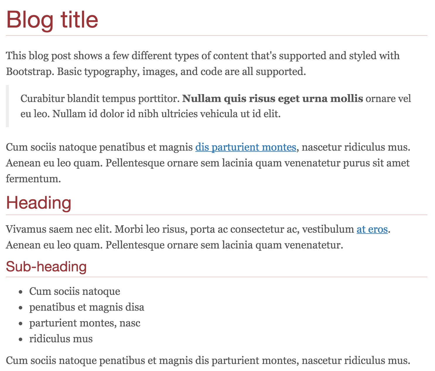 ]] --- ##Layout .columns[.col-40[ ``` css #content { width: 640px; float: left; } #sidebar { width: 320px; float: right; } #header { width: 100%; padding: 10px; overflow: hidden; } ``` ].col-60[ 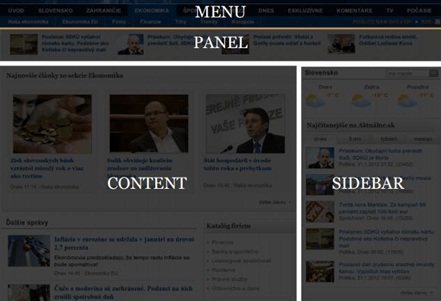 ]] --- ##Modules .columns[.col-40[ ``` css .pagination { border-top: 1px solid #ccc; margin-top: 1em; } .pagination > ul { list-style-type: none; } .pagination > ul > li { display: block; float: left; } ``` ].col-60[ 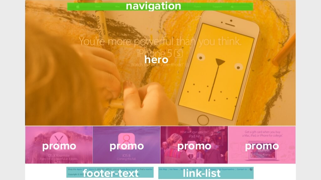 ]] --- ##States .columns[.col-40[ ``` css .pagination > li.active{ background-color: blue; color: white; } .accordion .collapsed { display: none; } .something .is-selected { font-weight: bold; } ``` ].col-60[ 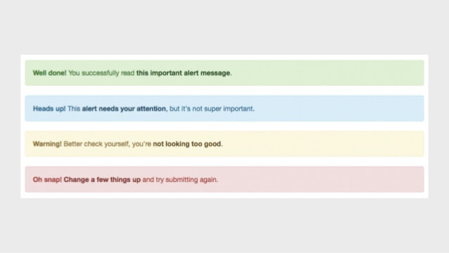 ]] --- ##Naming conventions .columns[.col-40.small[ ###Base h1, h2, a, p ###Layout **.l-*** _(.l-header, .l-sidebar)_ ###Module **.name** _(.button, news-list, .news-item)_ ###Sub-module **.name-subname** _(.news-item-highlight, .news-item-footer)_ ###State/Type **.is-***, **.name .name-type** _(.is-active, .is-disabled, .is-open)_, _(.news-item .news-item-primary)_ ].col-60.small[ ```html <aside class="l-sidebar"> <section class="news-list"> <article class="news-item news-item-primary"> <h1>The main article of the year!</h1> <p class="news-item-highlight">It is about cats.</p> <p>Nothing new, just some cats.</p> <a href="#" class="button">Go to article</a> <footer class="news-item-footer">Tags: cats</footer> </article> <article class="news-item"> <h1>Something happened</h1> <a href="#" class="button">Go to article</a> <a href="#" class="button button-small">Hide</a> </article> <article class="news-item"> <h1>You can't hide me!</h1> <a href="#" class="button">Go to article</a> <a href="#" class="button is-disabled">Hide</a> </article> </section> </aside> ``` ]] --- ##Project structure (using SCSS) Every project needs some organization. Much of the purpose of categorizing things is to codify patterns—things that repeat themselves within our design. Repetition results in less code, easier maintenance, and greater consistency in the user experience. Exceptions to the rule can be advantageous but they should be justified. .columns[.col-40[ ``` css @import 'setting'; @import 'mixin'; @import 'base'; @import 'layout/grid'; @import 'layout/alternate'; @import 'module/btn'; @import 'module/profile'; @import 'module/nav'; ``` ].col-60[ 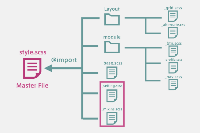 ]] --- layout: false #BEM BEM stands for “Block”, “Element”, “Modifier”. It is a front-end methodology: a new way of thinking when developing Web interfaces. ###BLOCK A block is an independent entity, a “building block” of an application. A block can be either simple or compound (containing other blocks). ###ELEMENT An element is a part of a block that performs a certain function. Elements are context-dependent: they only make sense in the context of the block that they belong to. ``` css .site-header { ... } /* block */ .site-header__logo { ... } /* element */ .site-header__logo—xmas { ... } /* modifier */ .site-header__navigation { ... } /* element */ ``` [http://bem.info/](http://bem.info/) --- #BEM .columns[.col-60[ 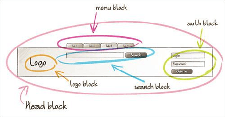 ].col-40[ 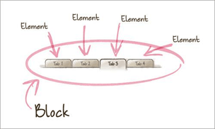 ]] --- #Style guides When a company builds a design system, they have a goal they’re trying to achieve: improving brand consistency, preventing duplicate work across teams, or increasing code quality. .center[ .img-wrap-70[] [http://styleguides.io](http://styleguides.io) ] --- #Material design style guide Google needed a more consistent user experience for users of its applications (Gmail, Calendar, Docs, etc.) and for the third-party applications on platforms like Chrome Add-ons and Android Apps. Using of Material Design is the easiest way for a developer to setup a good-looking Android interface. .center[ .img-wrap-70[] [https://material.io/guidelines/](https://material.io/guidelines/) ] --- #Bootstrap The most popular front-end framework for developing responsive, mobile first projects on the web. .center[ .img-wrap-70[] [http://getbootstrap.com/](http://getbootstrap.com/) ] --- #Other popular css frameworks .columns[.col-30[ <br/><br/> ].col-70[ **Foundation**. _The most advanced responsive front-end framework in the world._ [http://foundation.zurb.com/](http://foundation.zurb.com/) ]] .columns[.col-30[ <br/><br/> ].col-70[ **Primer**. _The CSS toolkit and guidelines that power GitHub._ [http://primercss.io/](http://primercss.io/) ]] .columns[.col-30[ <br/><br/> ].col-70[ **Materialize**. _A modern responsive front-end framework based on Material Design_ [http://materializecss.com/](http://materializecss.com/) ]] --- # Related resources - SMACSS book [https://smacss.com/book/](https://smacss.com/book/) - Bem by examples [https://seesparkbox.com/foundry/bem_by_example](https://seesparkbox.com/foundry/bem_by_example) - Bootstrap. Getting started [http://getbootstrap.com/getting-started/](http://getbootstrap.com/getting-started/)