Responsive Web Design
class: center, middle .title[ Front-end training # Responsive Web Design ] --- # Mobile website vs desktop The primary goal of mobile stylesheets is to alter the layout for a smaller display and to reduce bandwidth for slower mobile networks. ```html <link rel="stylesheet" href="site.css" media="screen" /> <link rel="stylesheet" href="mobile.css" media="handheld" /> ``` .img-wrap-70[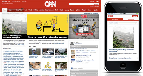] --- # The concept of responsive web design Responsive Web design is not only about adjustable screen resolutions and automatically resizable images, but rather about a whole new way of thinking about design. .img-wrap-70[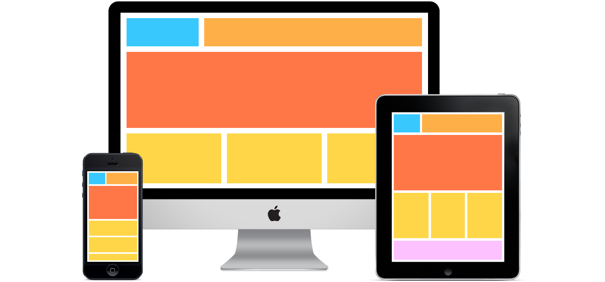] --- # Flexible everything "Responsive Web Design" by Ethan Marcotte May 25, 2010 at [alistapart.com](http://alistapart.com/article/responsive-web-design) .img-wrap-80[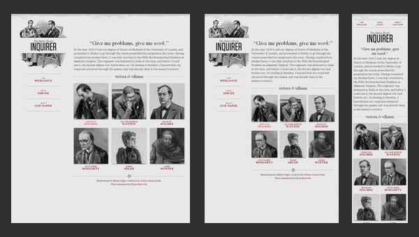] --- # Flexible images width The most popular option for working with images in responsive Web design is to use CSS’s max-width for an easy fix. ```css img { max-width: 100%; width: auto; height: auto; } ``` .img-wrap-70[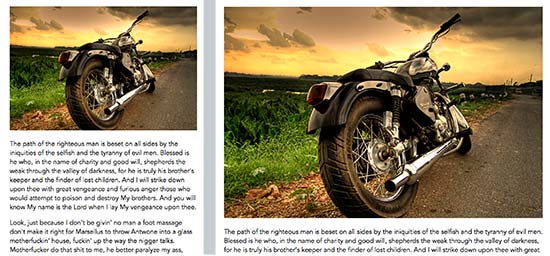] --- # Group of images in different resolutions This technique requires a few image files in different resolutions loaded for different screen size. Image switching may be implemented with help of some javascript plugin or by back-end based solution. ```html <img src="small.jpg" data-medium-src="med.jpg" data-large-src="large.jpg"> ``` .img-wrap-50[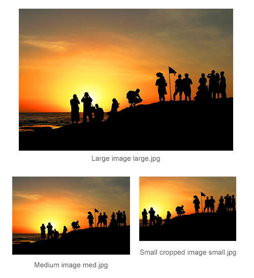] --- # HTML5 **picture** element `<picture>` element is a solution that is both complete and in need of no additional scripts or third-party services to do the job. ```html <picture> <source srcset="high-res.jpg" media="(min-width: 64em)"> <source srcset="med-res.jpg" media="(min-width: 37.5em)"> <source srcset="logo.svg" type="image/svg+xml"> <img src="fallback.jpg" alt="This picture loads on non-supporting browsers."> </picture> ``` [Example](https://googlechrome.github.io/samples/picture-element/) --- # Automatic page rescale on mobile devices On smartphones web designs automatically rescale to fit the tiny screen. A full-sized design, unless specified otherwise, would just shrink proportionally for the tiny browser. Then, the user could easily zoom in and out as necessary. However, if your page style is optimized for mobile devices we need to tell the mobile device to display the page without any zooming. ```html <meta name="viewport" content="width=device-width; initial-scale=1.0"> ``` .img-wrap-60[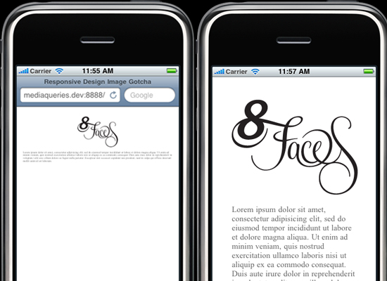] --- # Custom layout structure For extreme size changes, we may want to change the layout altogether, either through a separate style sheet or, more efficiently, through a CSS media query. .img-wrap-50[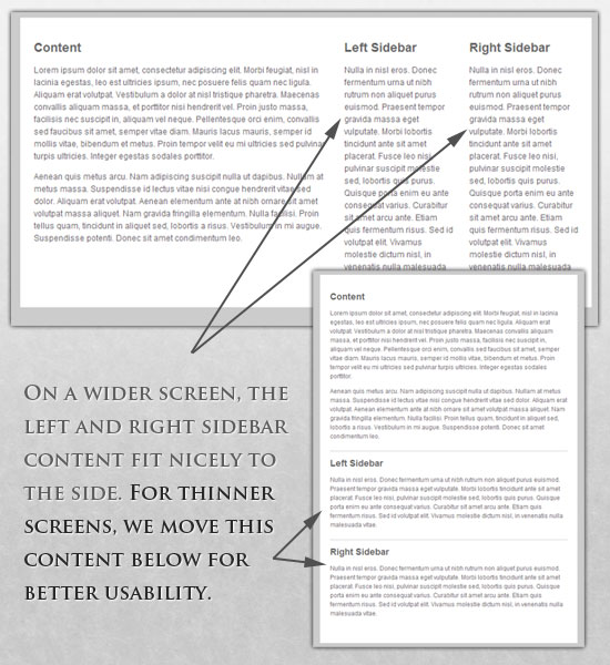] --- # Media queries CSS3 supports all of the same media types as CSS 2.1, such as screen, print and handheld, but has added dozens of new media features, including `max-width`, `device-width`, `orientation` and `color`. Media queries are supported by all modern browsers, no custom script is requred to make it work. ```html <link rel="stylesheet" type="text/css" media="screen and (max-device-width: 480px)" href="shetland.css" /> ``` Multiple media queries can also be dropped right into a single style sheet, which is the most efficient option when used: ```css body { font-size: 10px; } /* Smartphones (portrait) */ @media only screen and (max-width : 320px) { body { font-size: 16px; } } /* Smartphones (portrait and landscape) */ @media only screen and (min-device-width : 320px) and (max-device-width : 480px) { .content { padding: 0 2rem; } } ``` --- #CSS3 media queries ```css @media screen and (min-width: 600px) { .hereIsMyClass { width: 30%; float: right; } } @media screen and (min-device-width: 768px) { .minimumiPadWidth { clear: both; margin-bottom: 2px solid #ccc; } } @media screen and (orientation: landscape) { .iPadLandscape { width: 30%; float: right; } } ``` --- # Showing or hiding content It is possible to shrink things proportionally and rearrange elements as necessary to make everything fit (reasonably well) as a screen gets smaller. .columns[.col-50[ 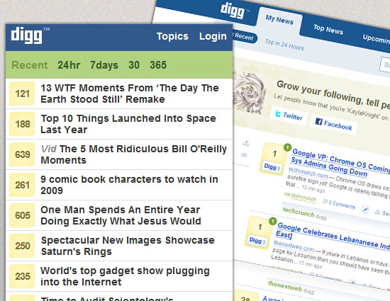 ].col-50[ 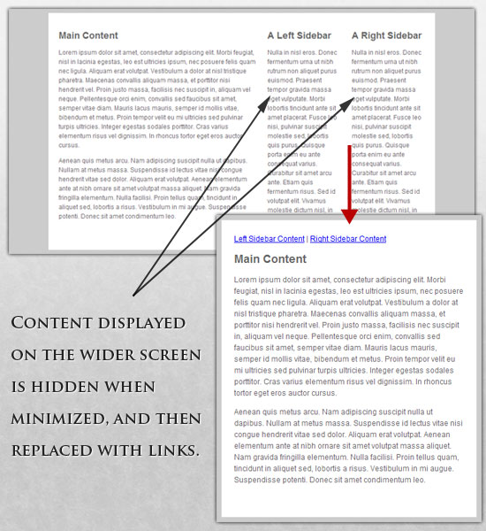 ]] --- # Responsive layout design 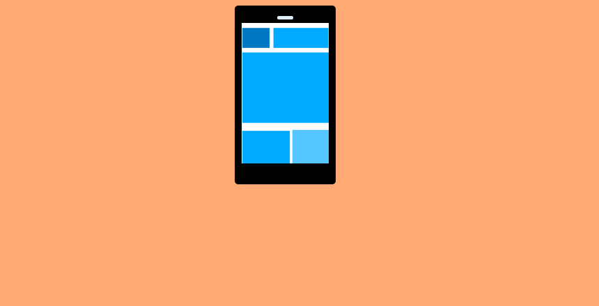 --- # Touchscreens vs. cursors Touchscreens obviously come with different design guidelines than purely cursor-based interaction, and the two have different capabilities as well. Touchscreens have no capability to display CSS hovers because there is no cursor; once the user touches the screen, they click. .img-wrap-70[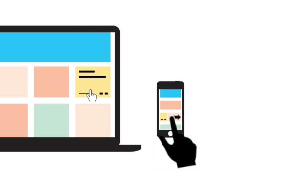] --- # Retina displays Smartphone device manufacturers introduced double density pixel screens for creating sharper images on smaller screens. However, this some issues for designers and developers as images that are not optimized for high-resolution screen will look less than stellar. .img-wrap-70[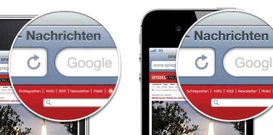] --- # Retina displays .img-wrap-80[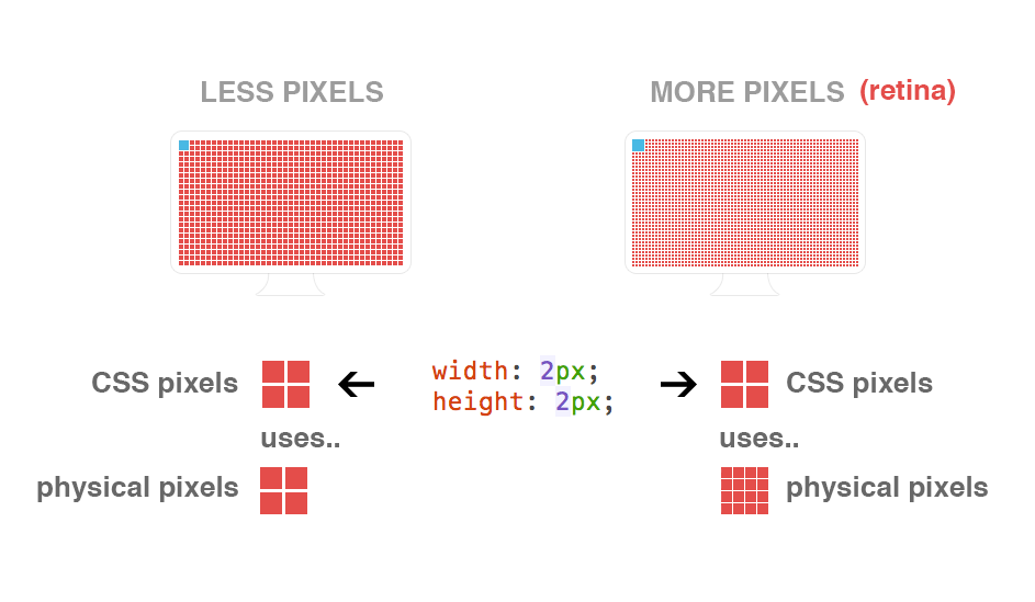] --- # Few coding techniques for retina displays Use media queries for high-res CSS styles ```css @media only screen and (-webkit-min-device-pixel-ratio: 2),(min-resolution: 192dpi) { /* High-res styles go here */ } ``` Have two versions of your CSS sprites: standard dimensions and @2x ```css @media only screen and (-webkit-min-device-pixel-ratio: 2),(min-resolution: 192dpi) { .logo{ background-image: url(assets/sprite@2x.png); background-size: 500px 500px; } } ``` .img-wrap-50[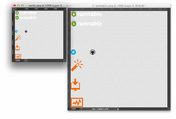] --- # Icon fonts - [http://fortawesome.github.io/Font-Awesome/icons/](http://fortawesome.github.io/Font-Awesome/icons/) - [https://icomoon.io/](https://icomoon.io/) - [https://css-tricks.com/flat-icons-icon-fonts/](https://css-tricks.com/flat-icons-icon-fonts/) - [http://propublica.github.io/stateface/](http://propublica.github.io/stateface/) .img-wrap-70[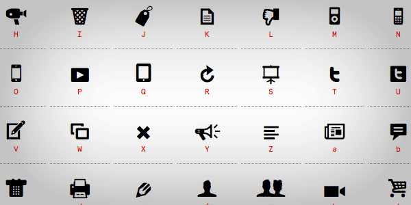] --- # “Mobile first” and “desktop first” .img-wrap-80[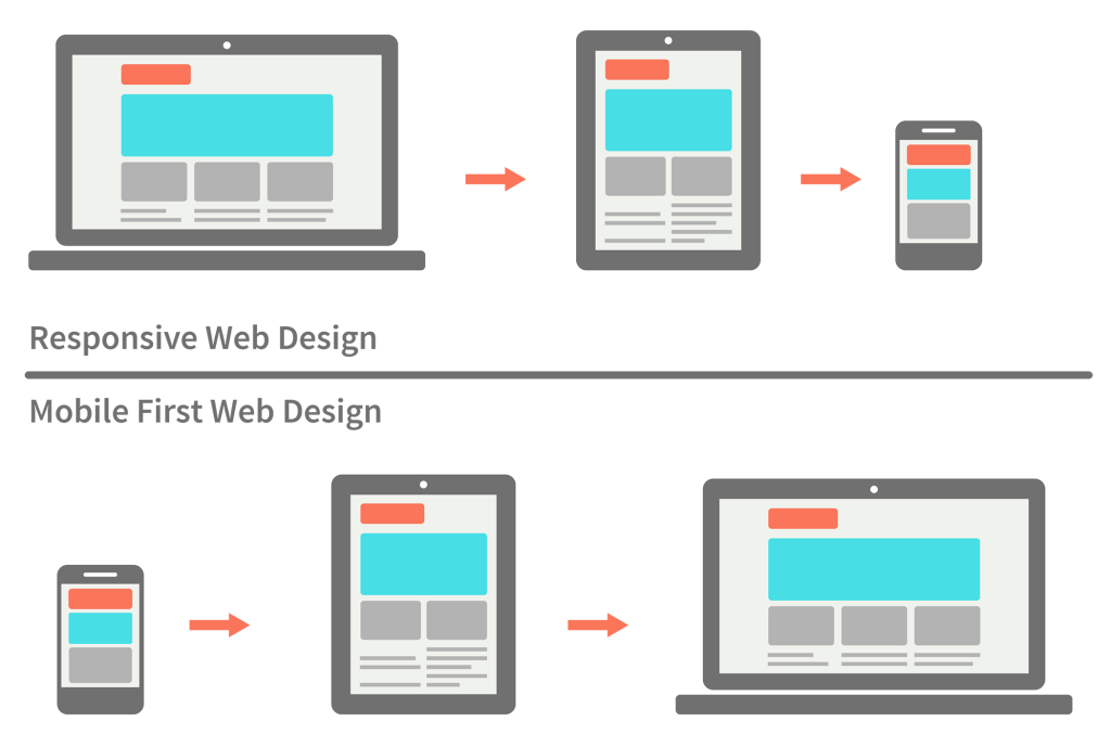] --- # Progressive enhancement and graceful degradation .img-wrap-80[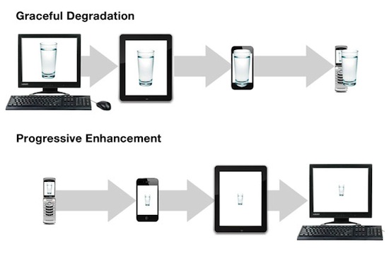] --- # Related resources - [Tutorials at **smashingmagazine.com**](http://www.smashingmagazine.com/tag/css/) - [Presentation about work with retina displays **pepelsbey.net**](http://pepelsbey.net/pres/clear-and-sharp/) - [The first famous article about responsive web design **alistapart.com**](http://alistapart.com/article/responsive-web-design) - [Responsive design inspiration at **mediaqueri.es**](http://mediaqueri.es/) - [Image scaling trick with aspect ratio](http://fredparke.com/blog/css-padding-trick-responsive-intrinsic-ratios)